WhatsApp’s Liquid Glass Design Update: A New Look for Everyday Conversations
A Subtle Redesign with Big Visual Impact
WhatsApp is quietly preparing one of its most noticeable interface transformations in recent years. Rather than introducing headline-grabbing features, the platform is focusing on something more fundamental: how the app looks and feels during everyday use.
- A Subtle Redesign with Big Visual Impact
- From Flat Design to Fluid Layers
- What Is the “Liquid Glass” Design?
- The Chat Interface Takes Center Stage
- A Consistent Design Language Across the App
- Why WhatsApp Is Making This Change
- Still in Beta: A Careful Rollout Strategy
- Part of a Larger Update Strategy
- Will Android Users Get It Too?
- The Bigger Picture: A Shift in App Design Philosophy
- Conclusion: A Familiar App, Reimagined
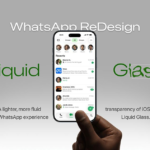
The upcoming “Liquid Glass” design update, currently being tested in iOS beta versions, signals a shift toward a cleaner, more modern visual experience. Inspired by Apple’s design language in iOS 26, the redesign introduces translucent layers, floating interface elements, and smoother animations—changes that aim to enhance usability without disrupting familiarity.
While still under development, the update reflects a broader trend across mobile ecosystems: interfaces are becoming lighter, more fluid, and visually integrated with the operating system.


From Flat Design to Fluid Layers
The Evolution Begins in Late 2025
The groundwork for this redesign was laid months ago. Around December 2025, WhatsApp began experimenting with subtle interface tweaks in early beta builds. Users noticed minor changes on the main chat screen—small but deliberate adjustments that hinted at a larger visual overhaul in progress.
These early signals pointed toward a departure from traditional flat UI elements, aligning instead with a layered, translucent approach that prioritizes depth and motion.


What Is the “Liquid Glass” Design?
A Softer, More Dynamic Interface
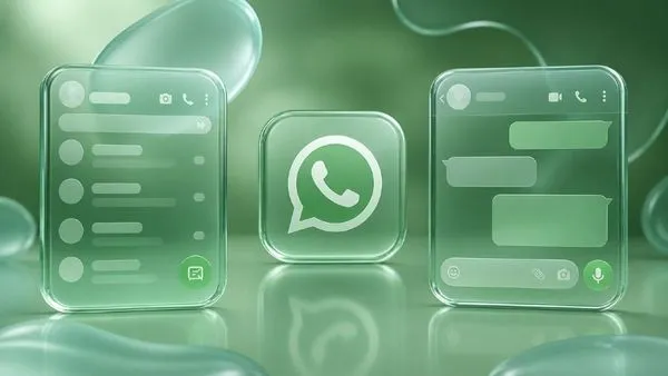
At its core, the Liquid Glass design is defined by transparency and layering. Instead of solid bars and rigid elements, the interface uses semi-transparent surfaces that allow background content to subtly show through.
This creates a softer, floating appearance—one that feels less static and more responsive. The effect is especially visible in:
- Floating tab bars
- Translucent navigation panels
- Frosted, glass-like buttons
- Smooth, fluid animations across interactions
The goal is not just aesthetics. By introducing depth and motion, WhatsApp aims to make navigation feel more intuitive while maintaining visual consistency across the app.
The Chat Interface Takes Center Stage
Where Users Spend Most of Their Time
Unlike previous updates that focused on menus or settings, this redesign targets the heart of the app: the chat screen.


WhatsApp is extending the Liquid Glass concept directly into conversations, refining how messages, controls, and navigation elements interact visually.
Key Changes Expected
1. Floating Chat Bar
The message input field—traditionally fixed at the bottom—is being reimagined as a floating strip. It appears slightly lifted from the screen, with a translucent background that blends into the chat.
2. Redesigned Shortcuts
Buttons like the “jump to latest message” control are being updated to match the glass-like aesthetic, ensuring visual consistency across the lower interface.
3. Transparent Navigation Bar
At the top of the chat, the navigation bar may become semi-transparent, allowing chat backgrounds to subtly show through instead of being blocked by solid headers.
These changes may seem incremental individually, but together they reshape how the entire chat experience feels.
A Consistent Design Language Across the App
Beyond Chats: System-Wide Visual Alignment
WhatsApp isn’t limiting the Liquid Glass design to the chat screen. The update extends to other interface components, including:
- Keyboard overlays
- Context menus
- Interactive controls
Each element adopts translucent backgrounds and subtle motion effects, creating a unified visual system where every part of the app feels interconnected.
This consistency is critical. It ensures that while the app evolves visually, it still feels familiar and easy to navigate.
Why WhatsApp Is Making This Change
Following Platform Trends
The move toward Liquid Glass design is not happening in isolation. Apple’s iOS 26 has emphasized transparency and layered visuals, setting a new standard for app design on iPhones.
By aligning with this design language, WhatsApp is effectively integrating more seamlessly into the iOS ecosystem. The result is an app that feels less like a standalone product and more like a native extension of the operating system.
Prioritizing Usability Over Complexity
Importantly, this update is not about adding new features. Instead, it focuses on improving how users interact with existing ones:
- Cleaner layouts enhance readability
- Floating elements reduce visual clutter
- Smooth animations improve navigation flow
The emphasis is on refinement rather than reinvention.
Still in Beta: A Careful Rollout Strategy
Testing Before Full Release
Despite visible progress, the Liquid Glass update is not yet widely available. WhatsApp is rolling out changes gradually through beta versions, particularly via Apple’s TestFlight platform.
Developers are closely monitoring:
- Performance impact
- User feedback
- Interface consistency across devices
This staged rollout allows WhatsApp to fine-tune the design before making it available to a global audience.
No Clear Timeline Yet
For now, there is no confirmed release date. Even beta users have not received the full experience, suggesting that a public rollout may still be some time away.
Part of a Larger Update Strategy
More Than Just Visual Changes
The Liquid Glass redesign is only one piece of a broader update cycle. WhatsApp is simultaneously testing several additional features, including:
- Encrypted cloud backup options
- Changes to status update visibility
- Integration of channels into the chat list
- A “Reshared many times” label to reduce misinformation
- Ending support for older Android versions by September 2026
These updates indicate a dual focus: improving both user experience and platform security.
Will Android Users Get It Too?
Uncertain but Likely
At present, the Liquid Glass design appears to be iOS-focused, largely because it mirrors Apple’s interface style.
However, WhatsApp has historically aimed for cross-platform consistency. While Android users may not receive the exact same design immediately, similar visual improvements could eventually be adapted for other platforms.
The Bigger Picture: A Shift in App Design Philosophy
WhatsApp’s move toward a Liquid Glass interface reflects a broader shift in how modern apps are designed.
Flat, rigid layouts are gradually giving way to:
- Layered interfaces
- Subtle motion
- Context-aware visuals
These changes are not just cosmetic—they influence how users perceive speed, clarity, and ease of use.
By embracing this approach, WhatsApp is positioning itself to remain visually relevant in an increasingly design-driven mobile landscape.
Conclusion: A Familiar App, Reimagined
The WhatsApp Liquid Glass design update may not introduce new features, but it fundamentally reshapes how users experience the app.
Through translucent layers, floating elements, and refined animations, WhatsApp is creating a cleaner, more immersive interface—one that aligns with modern design trends while preserving the simplicity that made the platform successful.
For users, the transition is likely to feel subtle at first. But over time, these visual improvements could redefine what everyday messaging looks and feels like.