Google Gemini App Gets a Makeover as Google Pushes Toward a Smarter AI Workspace
Google is rolling out a major redesign for its Gemini app, signaling a broader shift in how the company wants users to interact with artificial intelligence across mobile devices. The refreshed interface, currently appearing for some iOS users, introduces a cleaner visual style, expanded tool access, and a more immersive conversational experience that moves Gemini beyond the feel of a traditional chatbot.
The redesign arrives at a time when competition in the AI assistant market is intensifying. Companies are increasingly transforming AI apps into multifunctional productivity hubs capable of handling research, media creation, voice interaction, file management, and contextual learning in one place. Google’s latest Gemini overhaul appears designed to push the platform further in that direction.
According to screenshots and early user reports shared online, the new Gemini interface introduces animated backgrounds, redesigned navigation, reorganized tools, and a more streamlined prompt system. While the core AI capabilities remain unchanged, the overall user experience has been substantially refined.


A More Visual and Interactive Gemini Experience
One of the most noticeable changes is the redesigned homepage. The previous layout, which relied heavily on text prompts and static menus, has been replaced with a more modern interface centered around a pill-shaped prompt box and animated gradient backgrounds.
Instead of presenting users with multiple suggestions and prompts immediately on launch, Gemini now opens with a simpler greeting such as:


“What should we focus on?”
The minimalist approach gives the app a calmer and cleaner appearance while emphasizing conversation and interaction rather than cluttered navigation.
The updated interface also introduces a colorful pulsating background effect that becomes more dynamic during active chats. On iOS devices, the redesign heavily integrates Apple’s “Liquid Glass” visual language, featuring semi-transparent elements and softer interface layering.
Reports indicate that Google is using thinner rounded icons throughout the app, contributing to a more polished and contemporary design aesthetic.
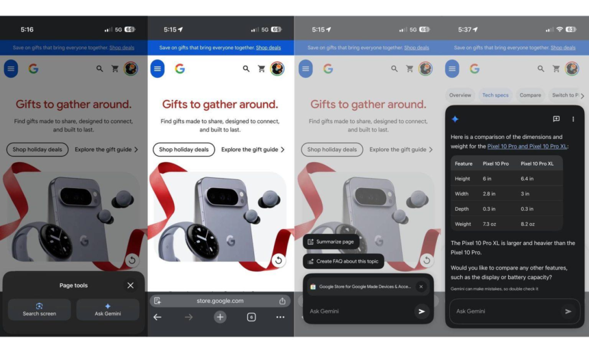
The Plus Button Becomes a Central Hub
Another major part of the redesign is the transformation of the plus (+) button into a multifunctional command center.


Previously used for limited actions, the button now opens a much larger panel containing several integrated Gemini tools and upload options. Users can now quickly access:
- Images
- Camera input
- Music tools
- Canvas
- Deep Research
- Guided Learning
- Videos
- Files
- Notebooks
- “More uploads” functionality
- NotebookLM resources
This redesign reflects a broader trend in AI software development where conversational assistants are evolving into full-service workspaces capable of managing multiple forms of media and productivity tasks from a single interface.
Instead of separating uploads, tools, and media shortcuts into different sections, Google is consolidating everything into one expandable menu system.
That change may seem subtle, but it fundamentally alters how users navigate the app. Gemini is no longer positioned merely as a question-and-answer chatbot; it increasingly resembles an AI operating layer for research, creativity, and productivity.
Google Is Simplifying the User Journey
The redesign also reorganizes key interface elements to create a less crowded experience.
The model picker — previously integrated into the prompt area — has now been moved to the top-left corner of the interface as a dropdown menu. This adjustment frees additional space within the main interaction area and gives conversations more room on screen.
Google has also repositioned the account switcher to the bottom of the navigation drawer, marking a notable departure from the company’s traditional app layouts.
Meanwhile, the “temporary chat” feature remains accessible near the top of the interface for users who prefer sessions that do not persist in history.
The app’s conversational flow has also received subtle visual improvements. Responses appear cleaner, transitions are smoother, and animations feel more deliberate, helping Gemini feel more polished overall.
Thinking Steps Are Now Hidden
One particularly interesting change affects users of Gemini’s more advanced reasoning models.
Previously, Gemini displayed “Thinking” or reasoning steps more openly during certain responses. In the updated design, Google has moved the “See thinking steps” option into the overflow menu.
This means users now need to open the three-dot menu to view how Gemini arrived at certain answers.
The change may reflect Google’s attempt to simplify the interface for mainstream users while still preserving transparency tools for advanced users who want to inspect the AI’s reasoning process.
However, some users may view the adjustment as a reduction in visibility for one of AI’s most useful educational features.
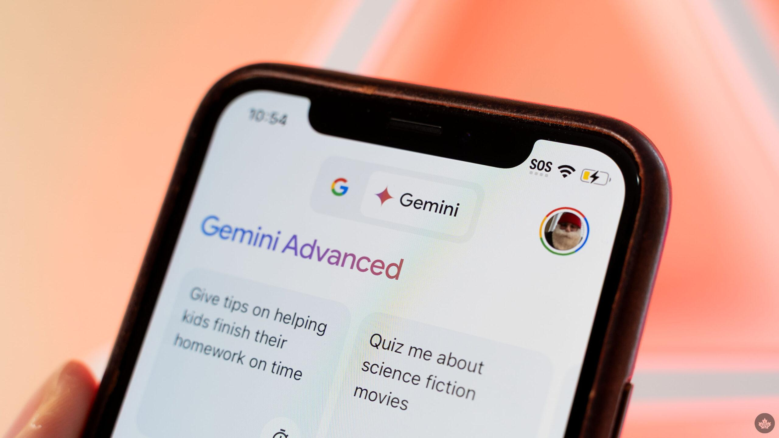
iOS Users Get the Update First
Despite Google owning Android, the refreshed Gemini experience is initially rolling out on iOS devices first — a decision that has sparked discussion online.
Users across Reddit and social platforms expressed surprise that Apple devices are receiving the visual overhaul ahead of Android users. Some commenters jokingly described the move as “rude,” while others questioned why Google apps often debut polished interface changes on competing platforms first.
Still, the explanation may be technical rather than strategic.
The iOS version allows Google to take advantage of Apple’s newer Liquid Glass design framework, helping Gemini achieve a more visually cohesive appearance on iPhones. Google has reportedly been testing portions of this unified interface approach across Android, desktop web, and Mac versions of Gemini as well.
At the moment, the rollout remains limited. Only some iOS users are seeing the redesign, and Google has not announced a firm timeline for Android availability.
Gemini’s Transformation Reflects a Bigger AI Shift
The redesign highlights a broader industry movement away from simplistic AI chat interfaces toward fully integrated AI ecosystems.
Modern AI assistants are increasingly expected to support:
- Voice conversations
- Live interactions
- Media generation
- Deep research
- File management
- Personalized learning
- Cross-platform workflows
Google appears to be restructuring Gemini to compete more aggressively in this new environment.
The visual redesign may seem cosmetic at first glance, but interface design strongly shapes how users interact with AI systems. By emphasizing tools, uploads, and multimodal capabilities more prominently, Google is encouraging users to treat Gemini as an active productivity environment rather than a passive chatbot.
Industry observers note that this direction mirrors similar trends across the tech industry, where companies are consolidating multiple AI features into unified interfaces.
Community Reactions Are Mixed but Curious
Initial reactions online have been largely positive regarding the new appearance.
Many users praised the cleaner homepage, smoother visual flow, and improved organization. Some described the redesign as a substantial improvement over the previous version’s more cluttered interface.
Others, however, expressed concern about the growing dependence on AI interactions in everyday life. A few Reddit commenters questioned whether society is becoming too reliant on conversations with machines instead of human interaction.
At the same time, the excitement surrounding the update demonstrates how central AI assistants have become within consumer technology ecosystems.
For Google, Gemini is no longer just another app. It is increasingly positioned as a core layer across Android, Workspace, Search, and productivity services.
What Comes Next for Gemini?
Although Google has not officially detailed the next phase of Gemini’s redesign rollout, the company is clearly investing heavily in creating a more unified AI experience across platforms.
The current changes suggest several likely future directions:
- deeper integration with Google Workspace tools
- expanded multimodal AI features
- richer live interaction capabilities
- more personalized AI workflows
- improved file and research management
- closer alignment between mobile and desktop experiences
The redesign also hints that Google sees Gemini as a long-term strategic product rather than a standalone experimental assistant.
As generative AI becomes increasingly embedded into daily computing, user experience design may become just as important as model performance itself. Google’s latest Gemini overhaul appears intended to ensure the app feels modern, intuitive, and capable of supporting the growing complexity of AI-powered workflows.
For now, iPhone users are getting the first glimpse of that future — while Android users wait for Google to bring the makeover home.