

OM Logo: A New Identity for Olympique de Marseille
In Marseille, few symbols carry as much weight as the emblem of Olympique de Marseille—known simply as OM. The club is now preparing to introduce a new logo, marking a significant shift in its visual identity and signaling a broader transformation underway within the organization.
- OM Logo: A New Identity for Olympique de Marseille
- The Evolution of the OM Logo: More Than Just Design
- A Strategic Rebranding Driven by Leadership
- What Will Change in the New OM Logo?
- The Leak and the Reaction
- Cultural Significance: Why the Logo Matters in Marseille
- Commercial and Strategic Implications
- What Comes Next: Timeline and Implementation
- A Defining Moment for OM’s Future
Scheduled for official unveiling on April 8, 2026, during a gala event tied to the “Treizième hOMme” program, the new crest will become the twelfth logo in the club’s history. This change is not just aesthetic; it reflects strategic repositioning, brand modernization, and evolving relationships with supporters.
The Evolution of the OM Logo: More Than Just Design
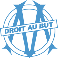
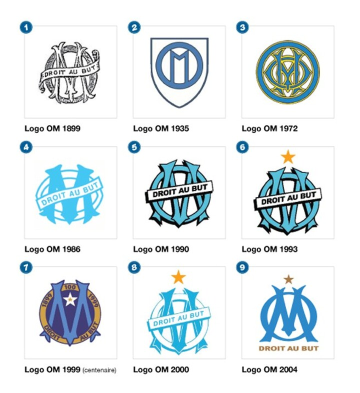
The OM logo has never been static. Over decades, it has evolved alongside the club’s fortunes, cultural identity, and ambitions. The current crest, introduced in 2004 under Christophe Bouchet, is now entering its final chapter.


Historically, OM’s emblem has functioned as more than a sports logo—it is closely tied to the identity of Marseille itself. The initials “OM” often carry symbolic weight comparable to the city’s own coat of arms, making any modification highly sensitive.
According to available records, the logo is also a registered trademark, governed by intellectual property laws and protected across jurisdictions . This underscores its value not only as a symbol but as a commercial asset.


A Strategic Rebranding Driven by Leadership
The decision to redesign the logo originated during a period of optimism within the club. Under the leadership of Pablo Longoria and Medhi Benatia, OM initiated a broader “three-year project” aimed at modernizing operations and strengthening its global brand.
The new logo is the culmination of that initiative. Internally, it is viewed as a necessary update to align OM’s visual identity with contemporary design standards while maintaining historical continuity.
Notably, the redesign coincides with organizational changes, including the relocation of some administrative staff to Avenue du Prado in early April—an operational move that reinforces the sense of transition within the club.
What Will Change in the New OM Logo?
A Cleaner, More Modern Design
Early leaks indicate that the new crest adopts a more streamlined and rounded shape, moving away from the more complex structure of the 2004 version. The design reportedly draws inspiration from older iterations used between 1935 and 1972, blending heritage with minimalism.


Flexible Branding Elements
One of the most discussed changes involves the treatment of two iconic features:
- The motto “Droit au but” (Straight to the goal)
- The star representing OM’s 1993 UEFA Champions League victory
While both elements will remain on official kits and some sporting equipment, the club plans to remove them from certain merchandise and branding applications. This modular approach reflects modern branding strategies, allowing flexibility across platforms and products.
The Leak and the Reaction
Despite efforts to maintain secrecy, the new logo was leaked online ahead of its official presentation. Interestingly, this was not the result of a cyberattack but rather the natural consequence of digital circulation and early registrations, including filings with the French National Institute of Industrial Property (INPI) .
Fan reactions have been mixed:
- Some supporters appreciate the cleaner, modern aesthetic
- Others criticize the departure from traditional elements
Internally, however, the club remains unconcerned. Leadership views this polarization as a typical response to major identity changes, especially in a club with such a strong cultural footprint.
Cultural Significance: Why the Logo Matters in Marseille
In many football cities, a logo is branding. In Marseille, it is identity.
The OM emblem is deeply embedded in local culture, representing pride, resilience, and a unique Mediterranean spirit. Any modification inevitably triggers emotional responses because it touches on collective memory and belonging.
This explains why even relatively subtle changes—such as adjusting typography or removing symbolic elements—can generate significant public debate.
Commercial and Strategic Implications
From a business perspective, the new logo serves multiple objectives:
1. Brand Modernization
A simplified design improves adaptability across digital platforms, merchandise, and global marketing campaigns.
2. Merchandising Flexibility
By allowing variations (with or without the star and motto), OM can diversify product lines and target different market segments.
3. Global Positioning
A refreshed identity aligns OM with other major European clubs that have recently undergone similar rebranding efforts.
What Comes Next: Timeline and Implementation
The rollout of the new OM logo will follow a structured timeline:
- April 8, 2026 – Official unveiling at Fort Ganteaume
- Early April 2026 – Administrative transitions and internal alignment
- 2026–2027 Season – Full implementation on kits and branding
Supporters will likely see the new emblem prominently featured when the team returns to competition, including key Ligue 1 fixtures.
A Defining Moment for OM’s Future
The introduction of a new logo marks more than a visual update—it represents a strategic inflection point for Olympique de Marseille.
Balancing tradition with modernization is a complex challenge, particularly for a club with deep cultural roots. Yet OM appears committed to navigating this transition with a long-term perspective, even at the cost of short-term controversy.
Ultimately, the success of the new logo will not be measured solely by design approval but by how effectively it integrates into the club’s evolving identity—on the pitch, in the marketplace, and in the hearts of supporters.